-
Architects: DA architects
- Area: 275 m²
- Year: 2017
-
Photographs:Minko Minev
-
Manufacturers: Ariostea, Herman Miller, Magis, Samsung, Wittmann
-
Lead Architects: Yuri Tanov, Martin Ryashev, Aleksandar Asenov
Text description provided by the architects. Looking for a different perception of the environment, typical for a bank branch, our studio developed a detailed concept for the renovation of DSK Bank network. We completed the pilot design of a centrally located bank office, opened for customers at the beginning of 2017.
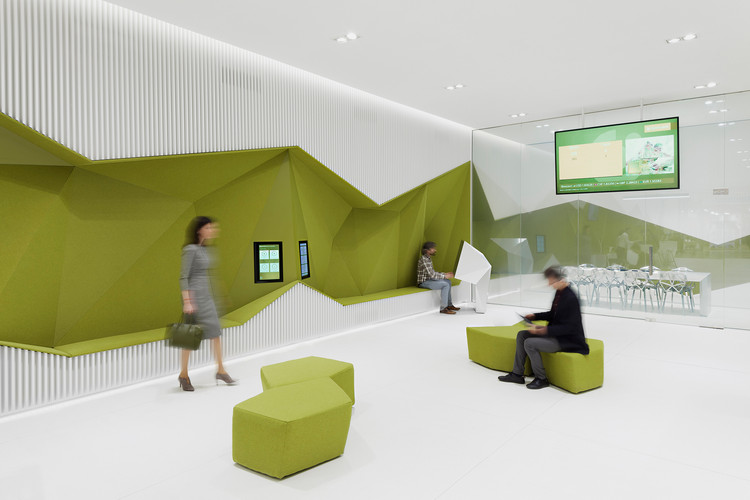
We moved the functional units from their common location in the center of the office to its periphery, in order to make room for a spacious and open common area. The function of the separate units defines the dynamics of the surrounding walls, bringing the interior to life and integrating aesthetics and usability.
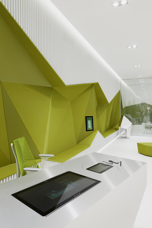
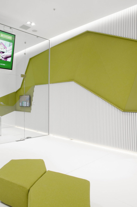
Both long sides of the surrounding walls are covered with white vertical louvers, intersected by a dynamic green strip. The strip forms concave spaces with diverse height and depth.
The cavity behind the louvers, above and below the green niches, is used to hide and integrate most of the required systems and devices.
Being a public space with orthogonal shape, flat and solid floor and ceiling, the branch required more thoughtful treatment of the walls in order to achieve acoustic comfort. The vertical louvers and the variously oriented upholstered panels contribute to the good acoustics.
The bank’s branch is an open space that combines consultants' desks, waiting areas and a few self-service or informational devices. Consultants' desks are designed as blocks, shaped by stainless steel panels, styled as the polygonal green strip, which makes them look like they are extracted from it.
The video consulting module is also designed as a solid volume that revolves around a vertical axis, in order to be suitable for disabled people.
A private consultation room is situated at the end of the bank office, separated from the rest of the area by a glass wall that switches in seconds into non-transparent mode.
The simple and definitive design of the completed bank office contrasts the ornate and multicolor surrounding of the shopping mall. It distinguishes it and attracts the attention of passers-by. The balanced use of materials and textures, the unified modeling language and the stark geometrical and color accent define a distinct, notable, and contemporary space.